Plum Panda
Visual identity and social content for a new yoga and movement label.
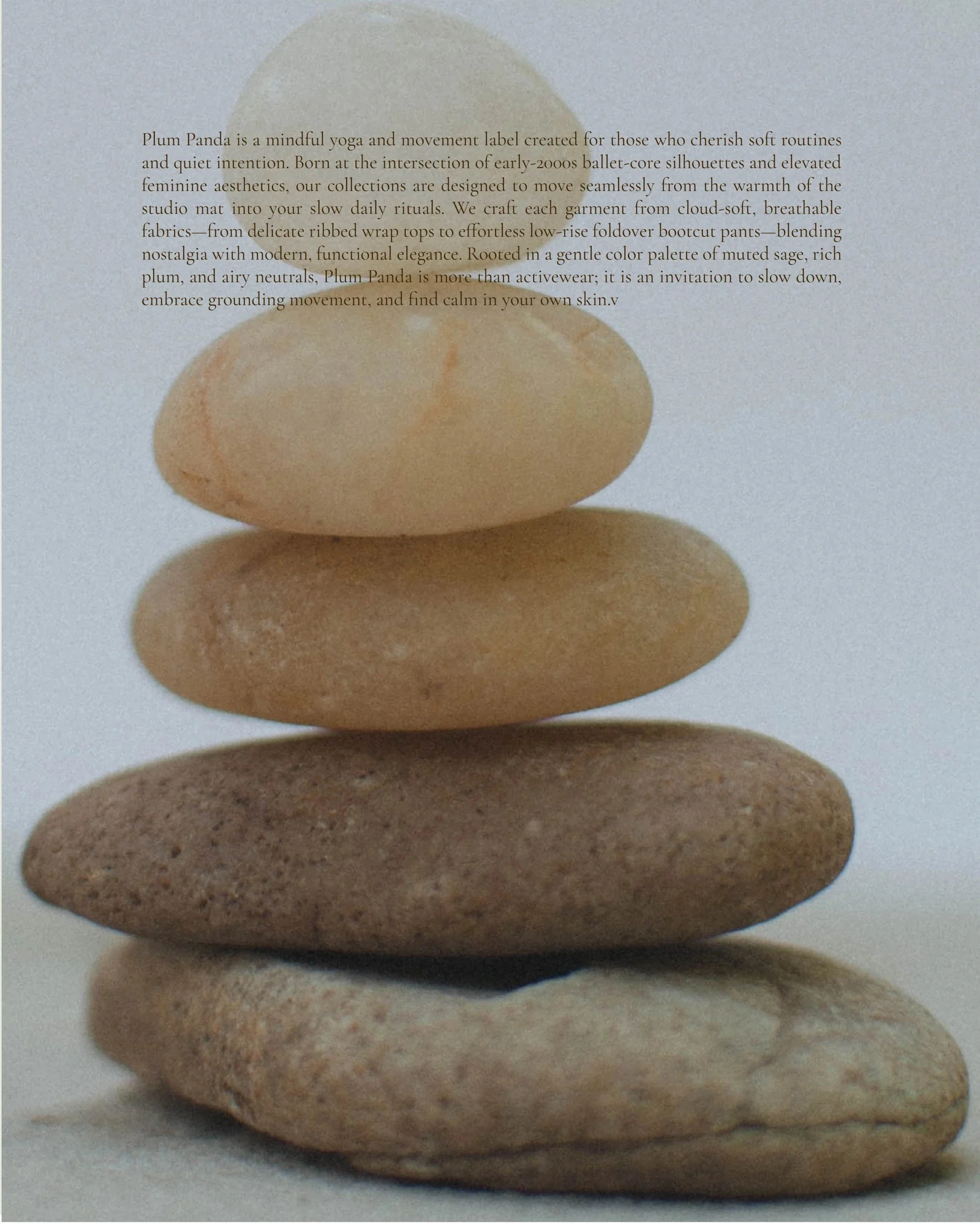
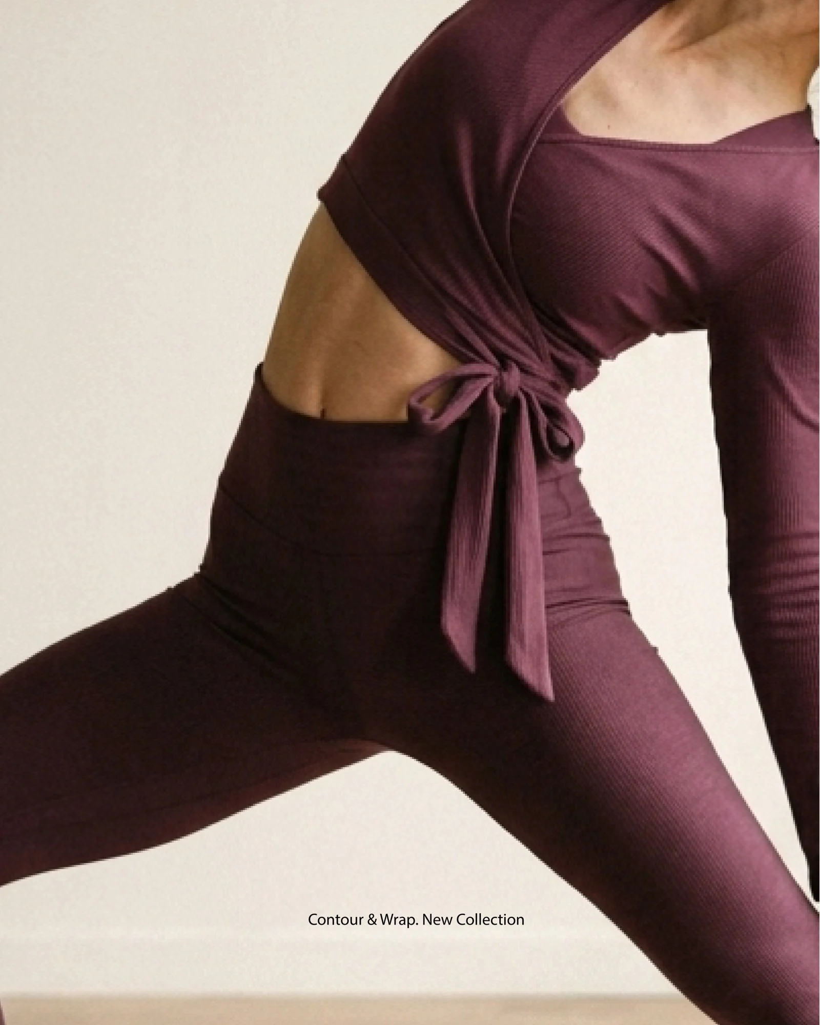
The challenge was to build a brand for a friend’s new yoga and movement label, one that feels as calm and peaceful as the practice itself. Plum Panda is for women who enjoy their routines and feel connected to nature. The clothes mix early-2000s ballet-core silhouettes with a calm, feminine look: ribbed wrap tops, low-rise bootcut pants and pieces comfortable enough to wear every day.
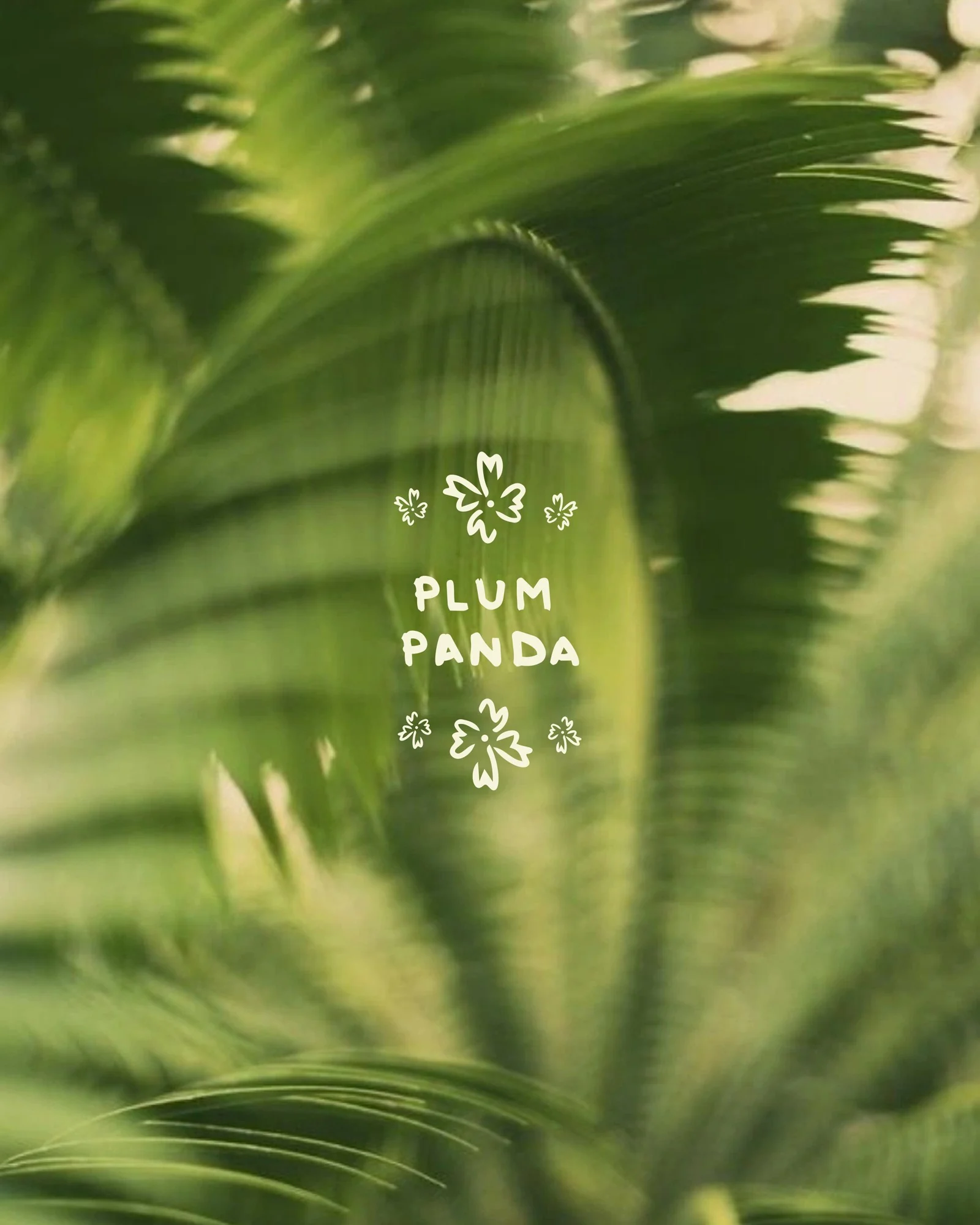
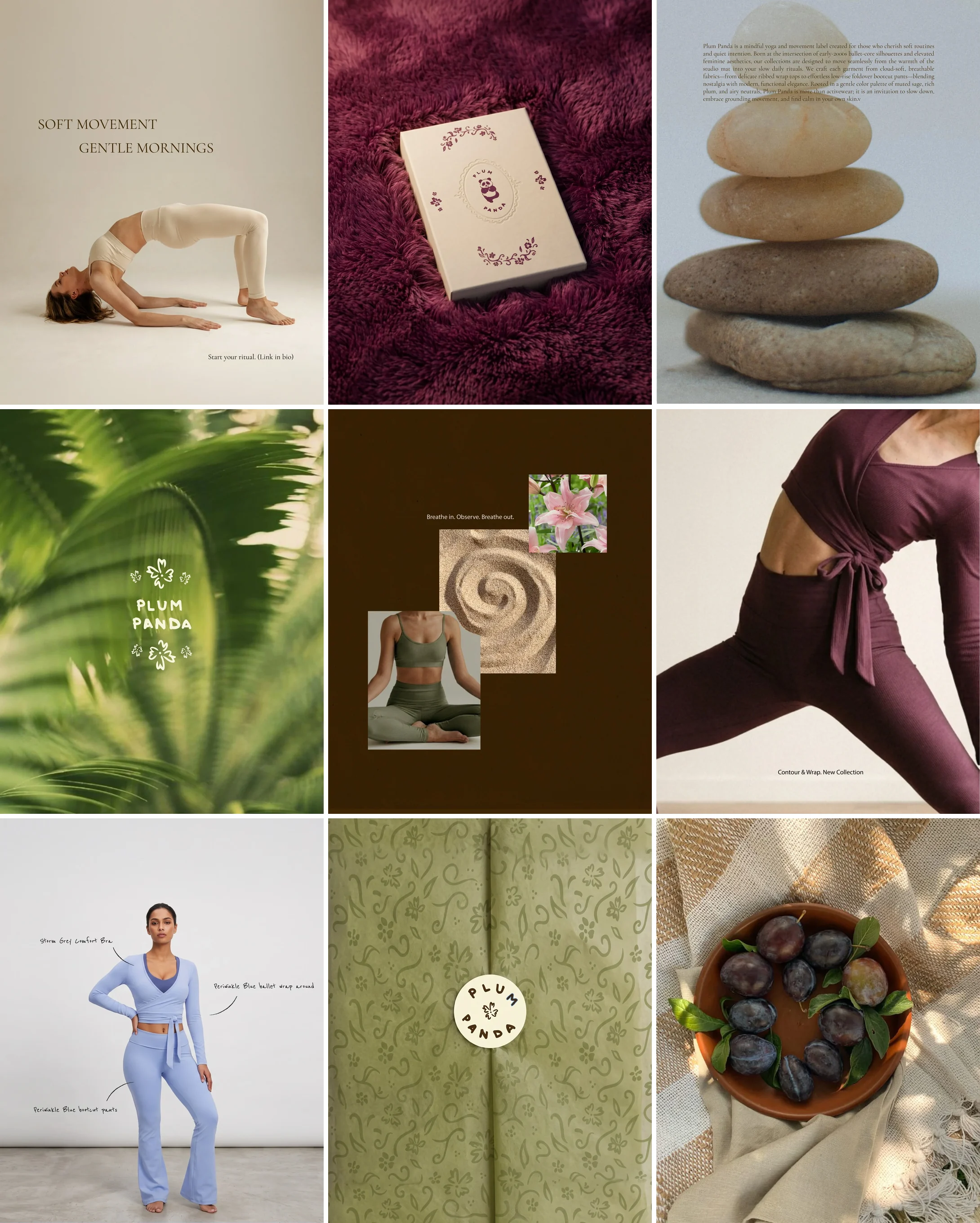
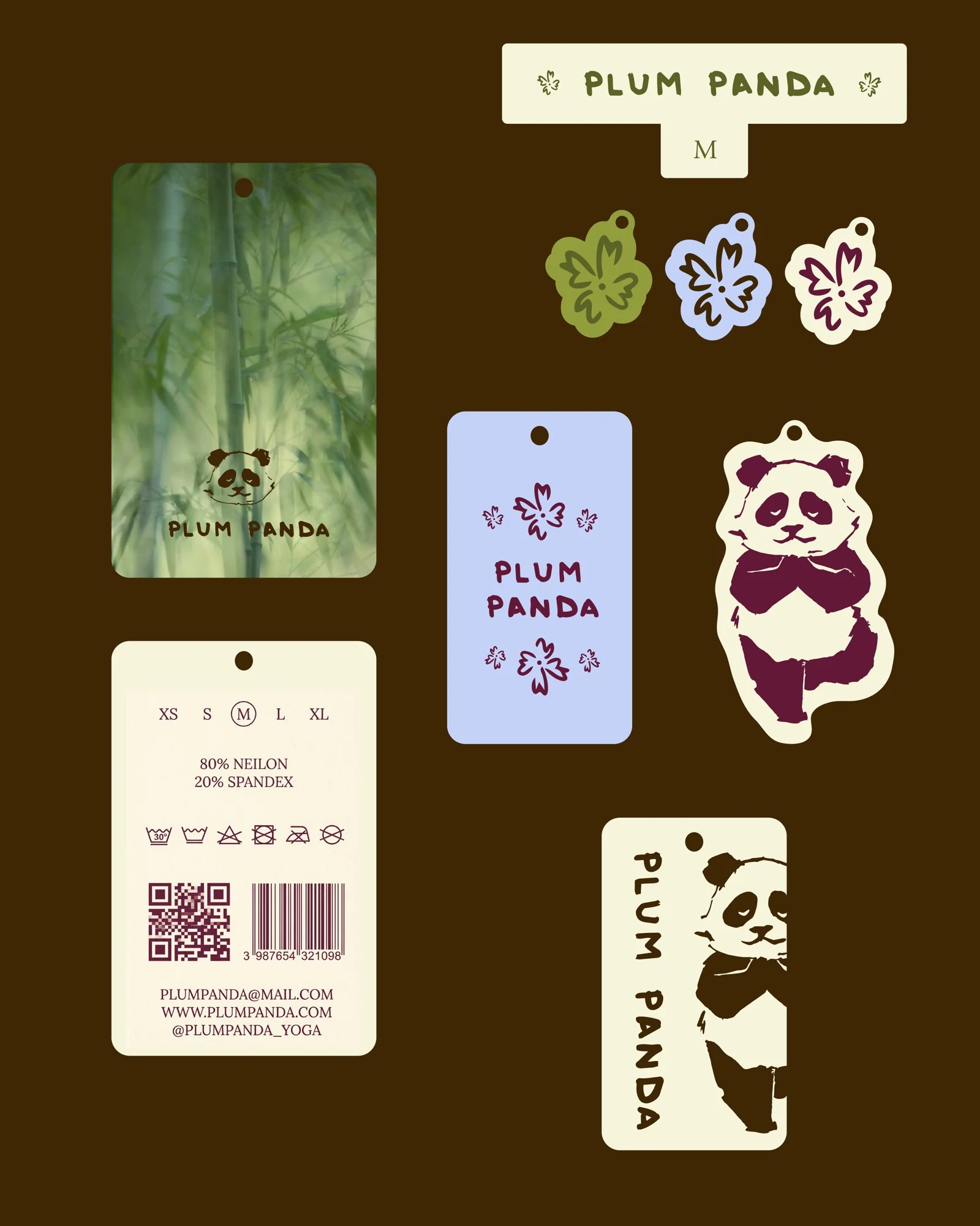
Rather than going for a loud Y2K look, I kept the identity serene, with a restrained color palette, soft visuals and a clear photography style. I created the full visual identity, from a hand-drawn panda mascot, logo system, pattern, palette and type, and took it into labels, packaging and a launch set of Instagram posts and stories.

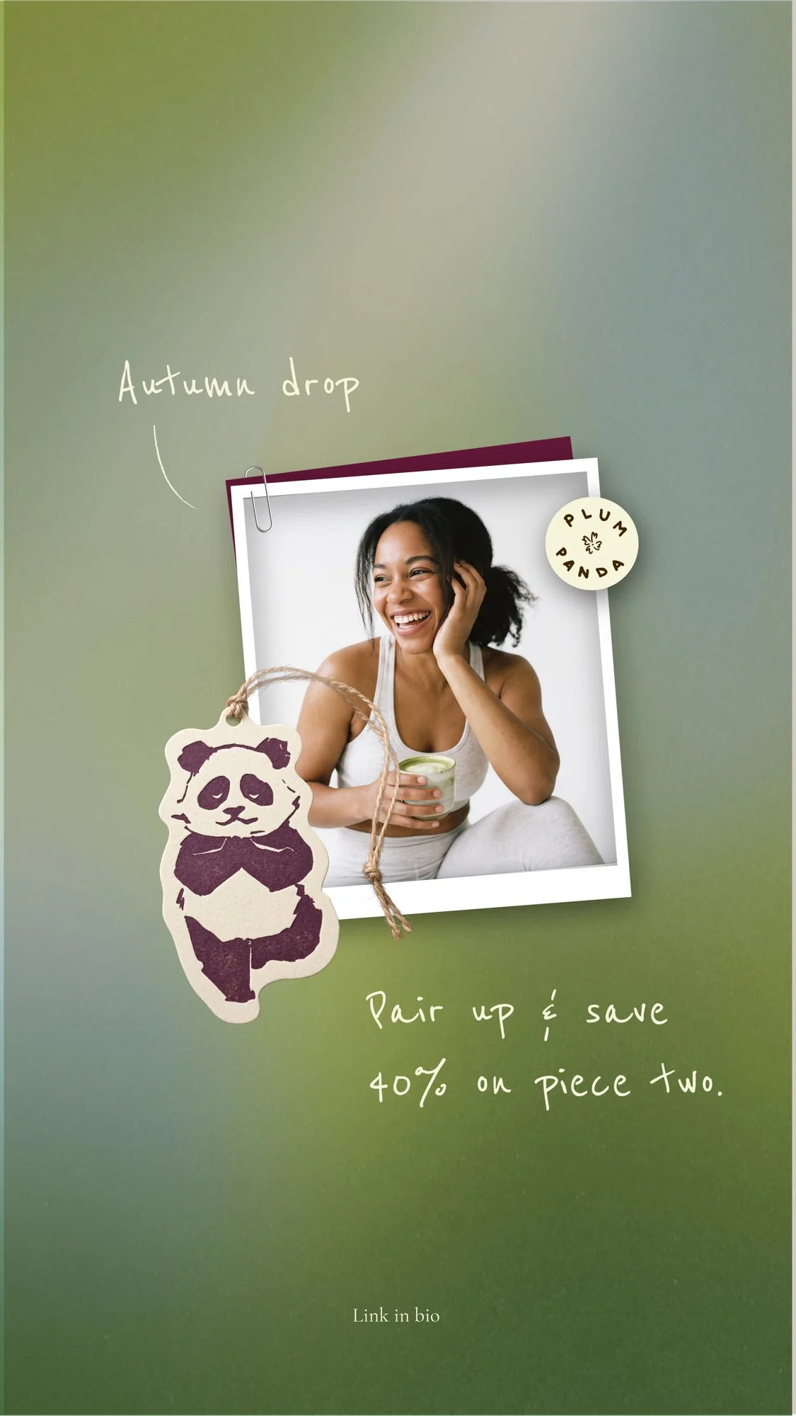
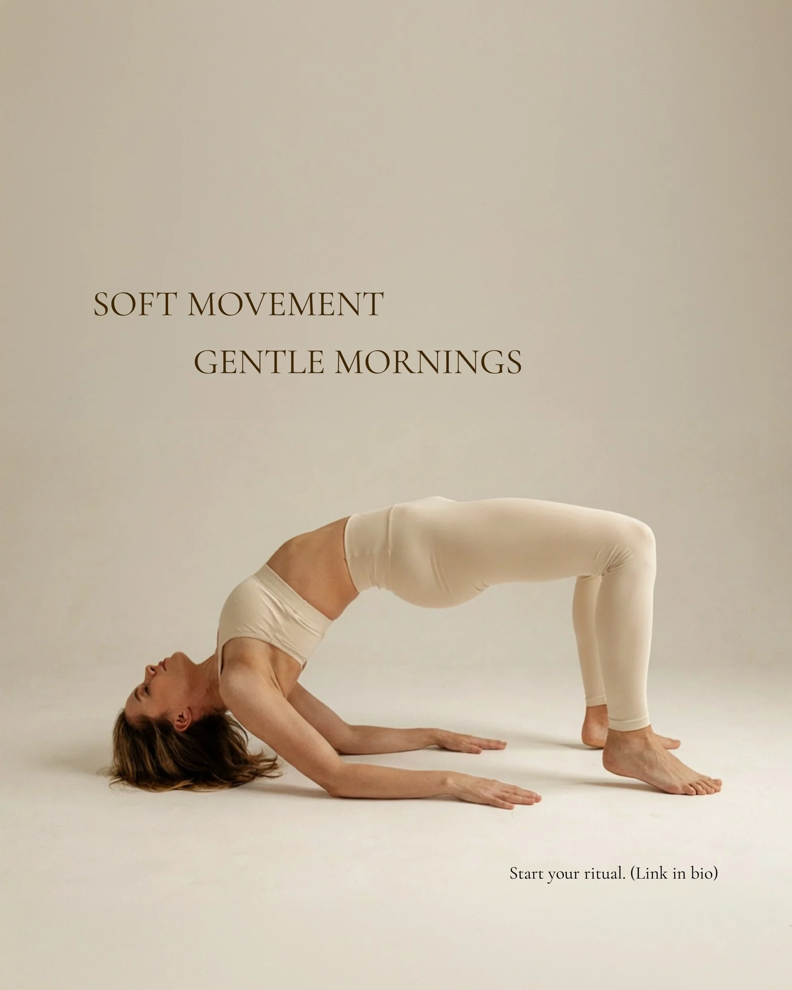
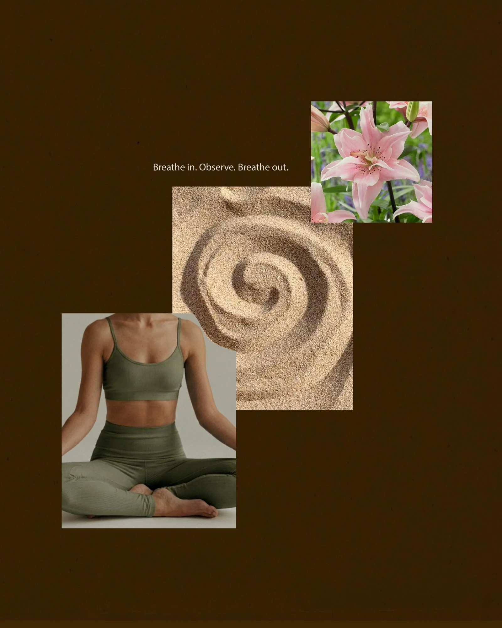
The launch content follows the same calm mood: sage, plum and chocolate brown, lots of white space, and the panda as a recurring part of the brand.


Visual identity
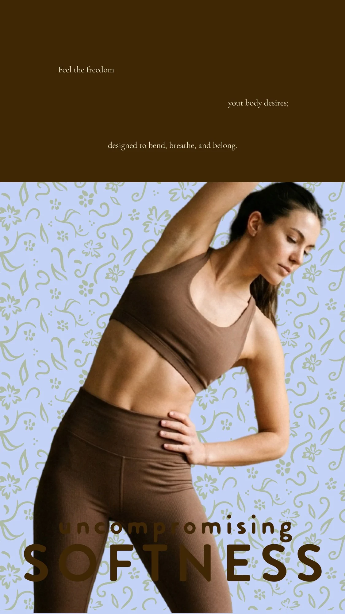
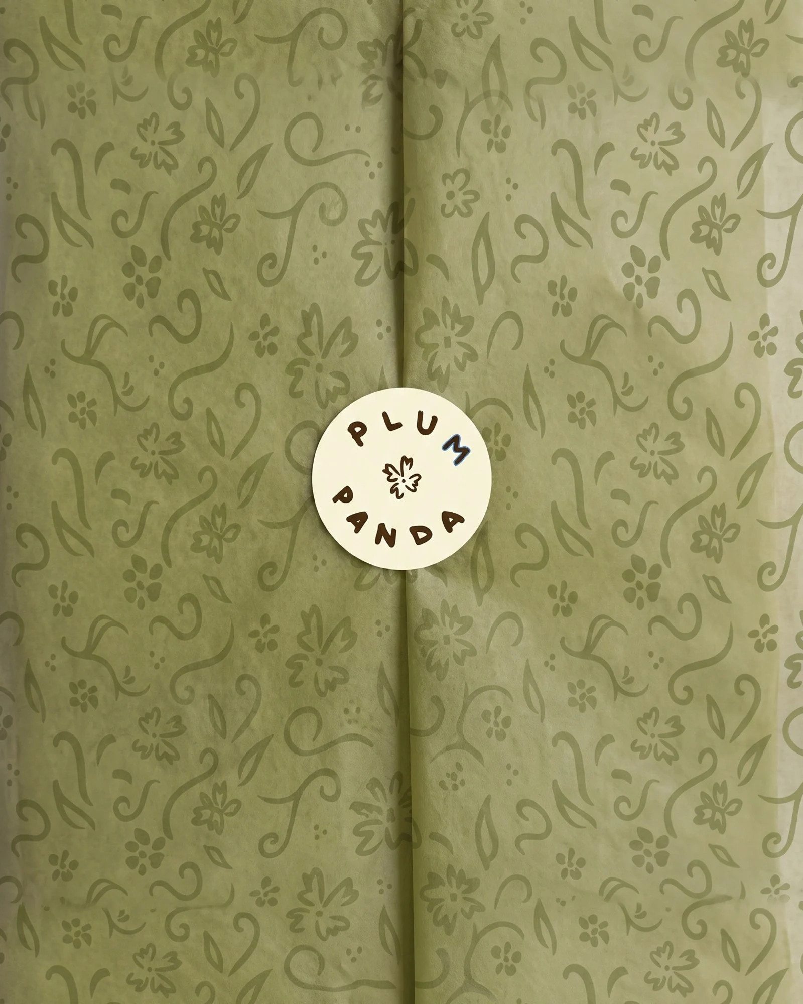
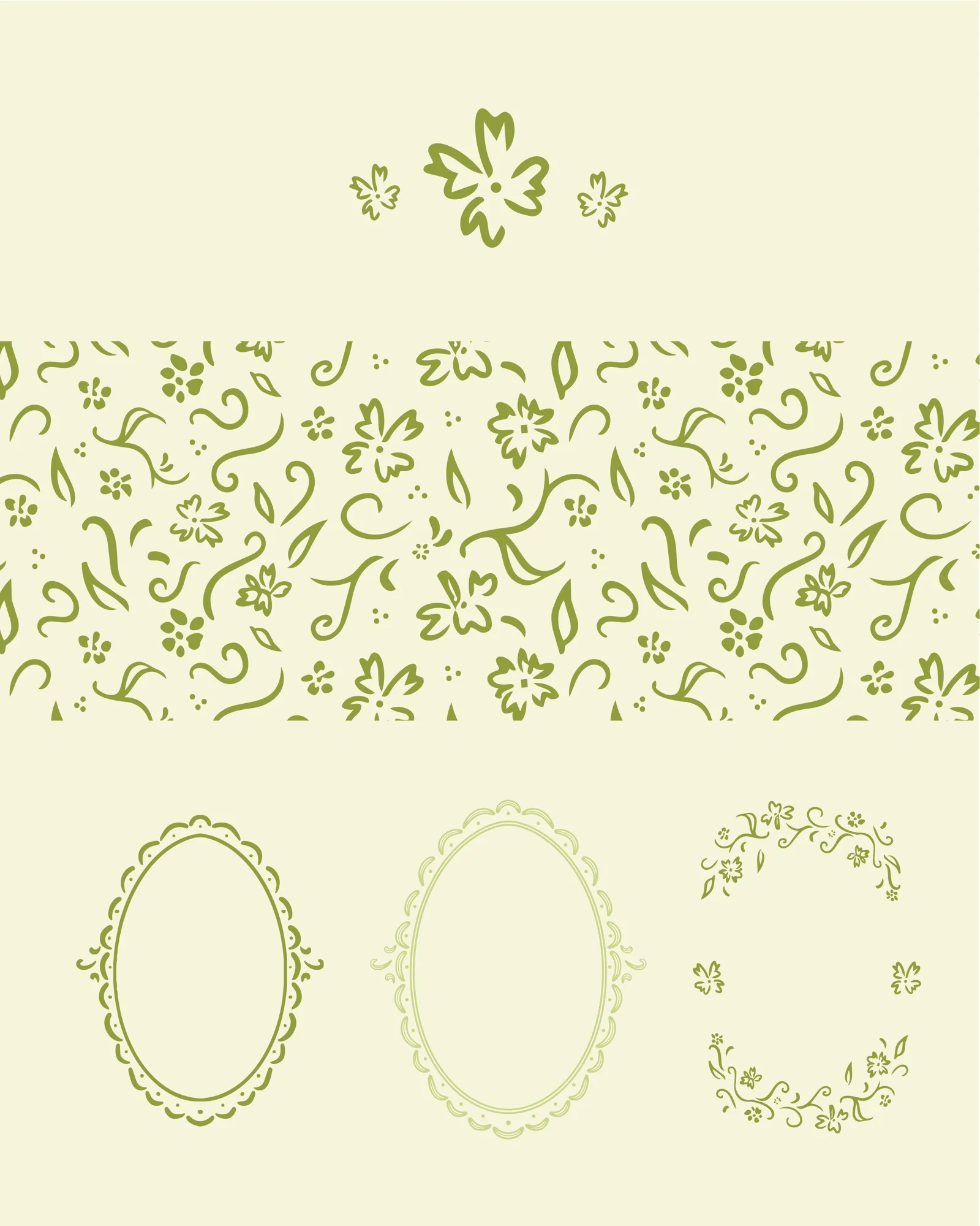
The logo system starts with a hand-drawn panda and includes several variations for different applications, from a vintage oval badge to the panda on its own. It pairs a rounded sans for titles with a soft Garamond for text and a handwritten font for little notes. The palette comes from earth and fruit: olive, sage, chocolate, plum, periwinkle and a buttery cream, tied together by a leafy pattern.



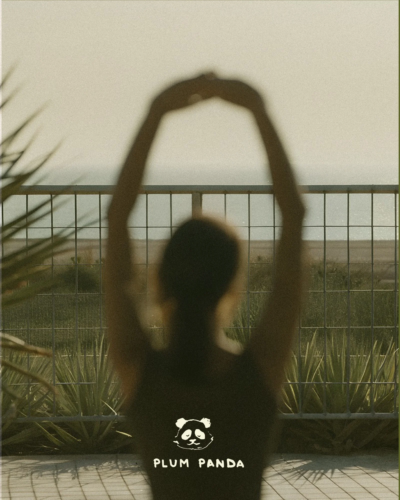


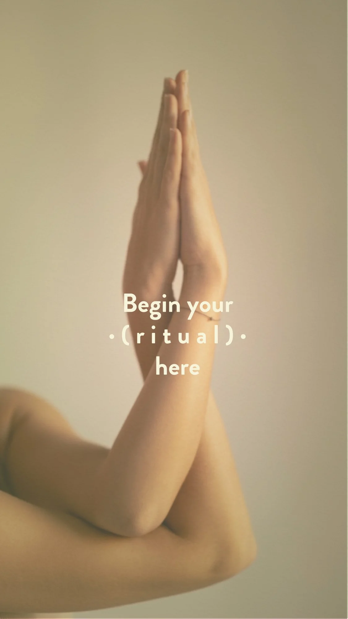
Stories for launch week, in the same palette with a few handwritten touches.