Personal Brand
Identity, content strategy and website for my personal brand.
For my degree thesis, I explored personal branding for artists: why it matters, and how a cohesive visual world can communicate an artist’s identity across every touchpoint. I then applied that research to my own practice, developing a personal brand for myself as an aspiring illustrator and designer.
I began by researching how independent illustrators build and engage an audience. From there, I defined my own position, identified the audience I wanted to reach, and considered how I could present myself online in a way that felt authentic to my practice. These insights shaped the visual identity, content strategy, and this website, creating a cohesive brand designed to work across every touchpoint.
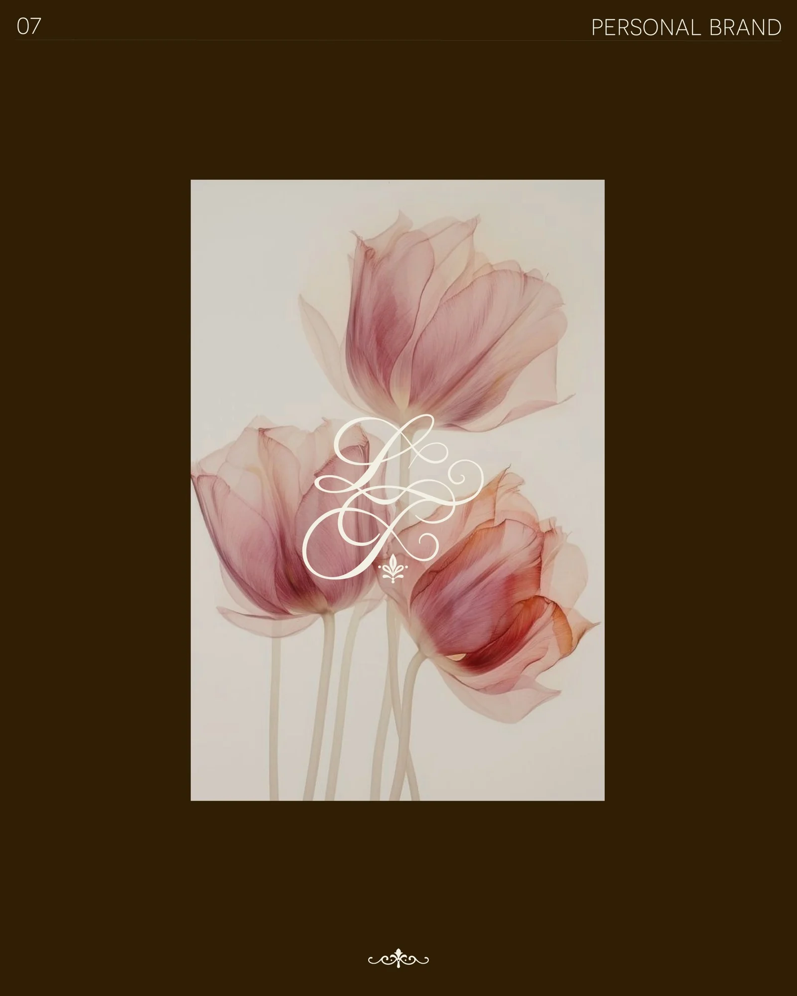
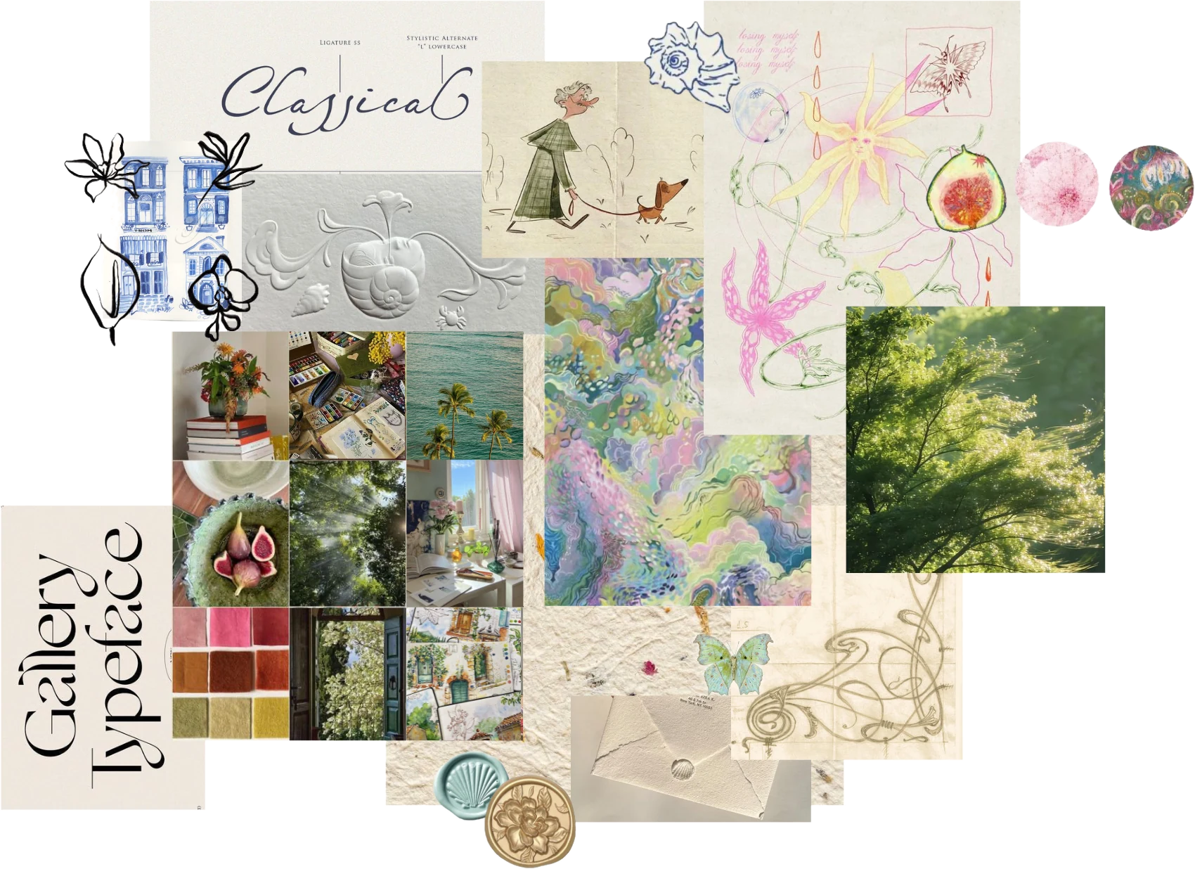
The moodboard was built with references leaning towards editorial typefaces and layouts, handmade and tactile details, everyday photos and, of course, illustration.
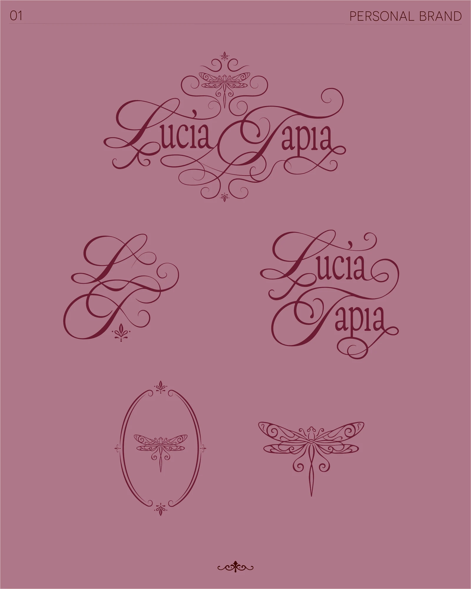
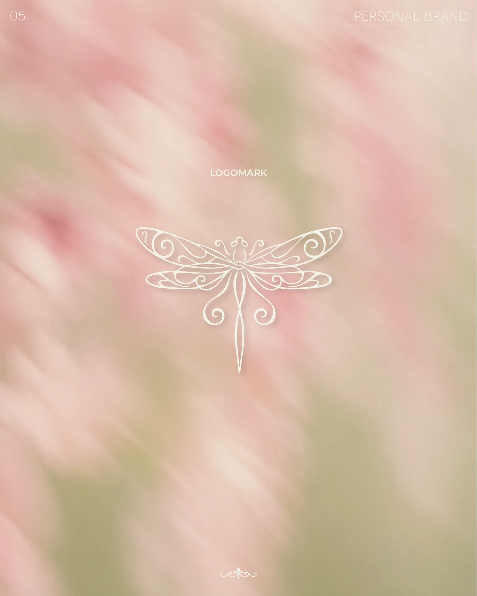
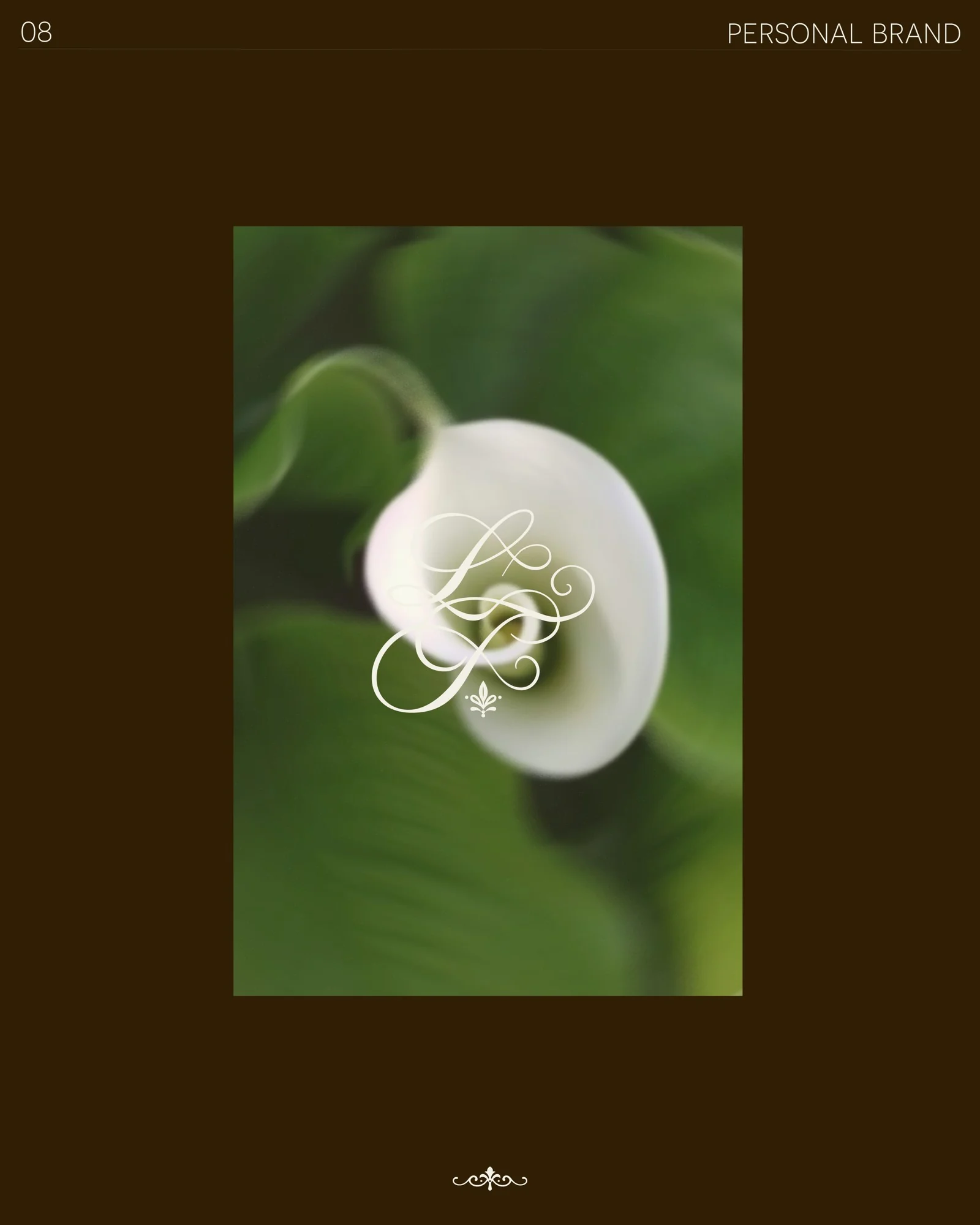
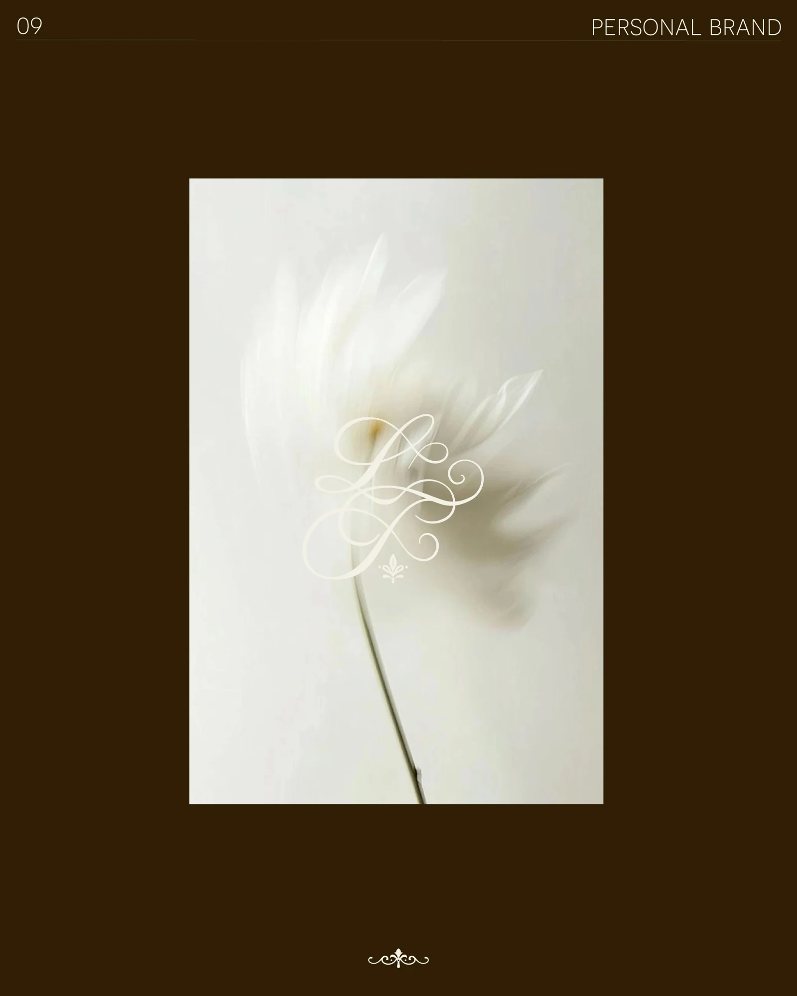
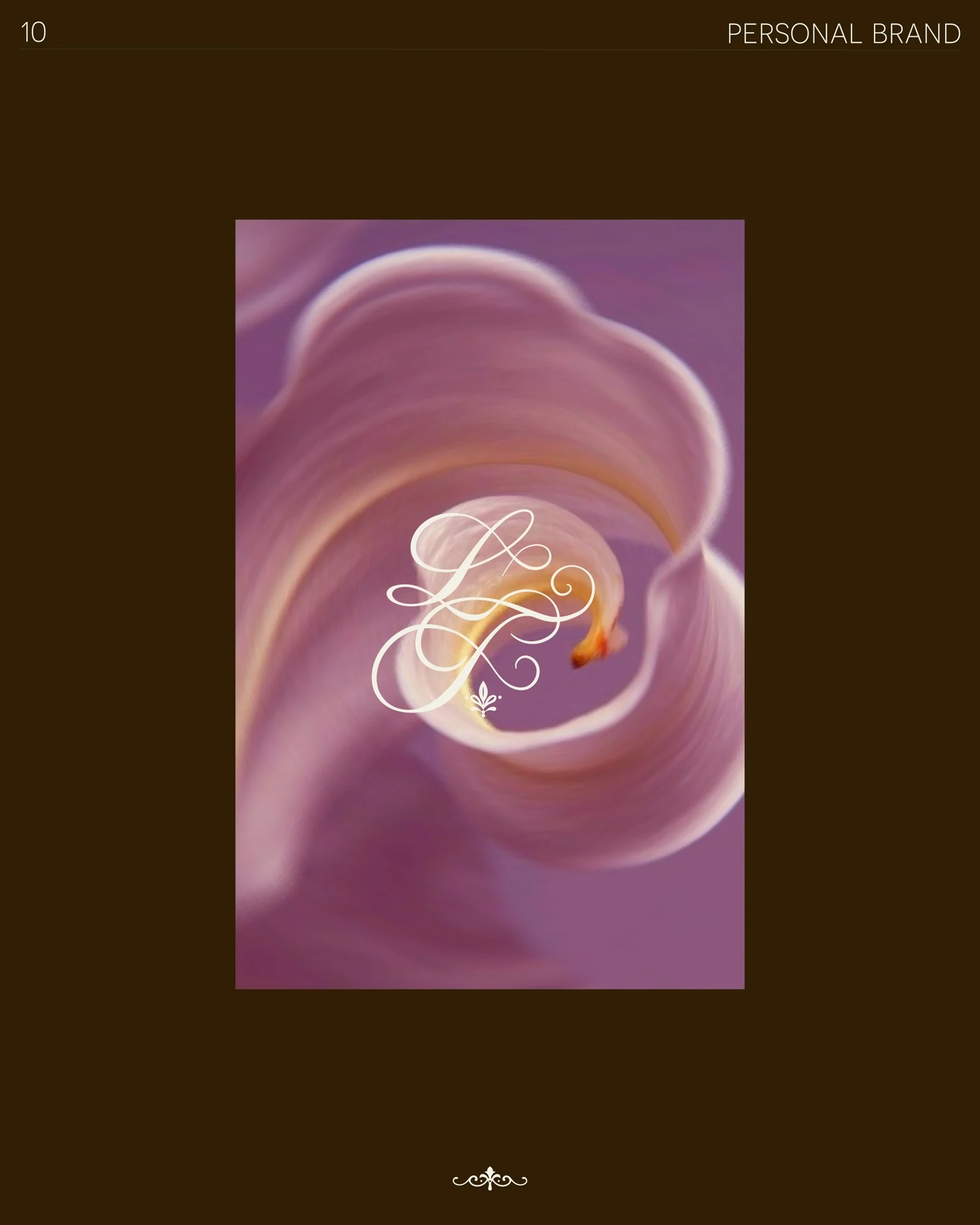
A romantic, hand-drawn identity with elegant flourishes. A full logo system with alternative versions ready for packaging and future applications.
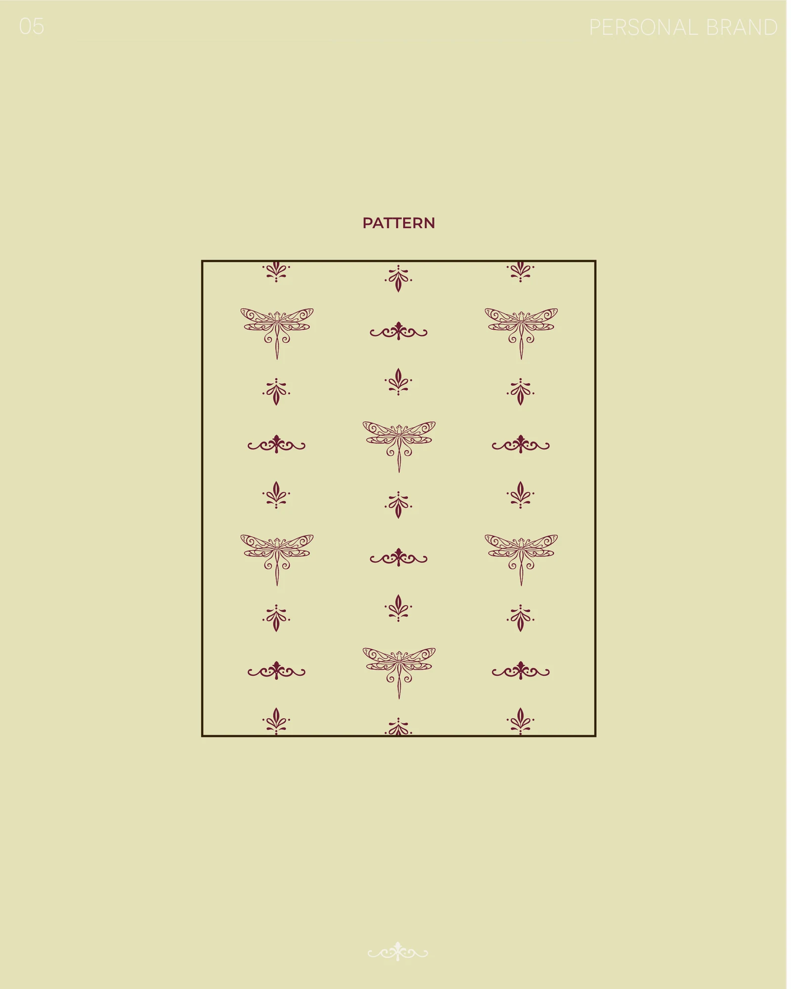
The dragonfly also works on its own as the main logo symbol, and together with small hand-drawn ornaments it becomes a pattern for posts, possible packaging and the website.
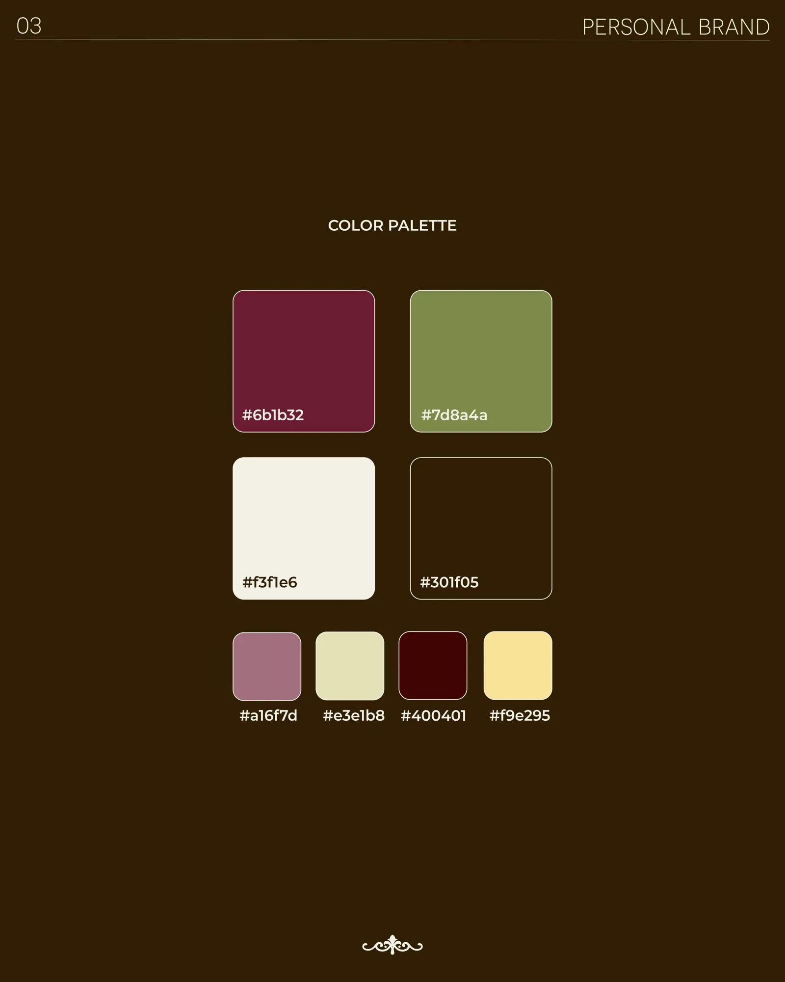
Burgundy and olive are the main colors, with dark brown and cream as a base. Dusty rose, light olive and butter yellow are for small details, so the palette feels rich but grounded.
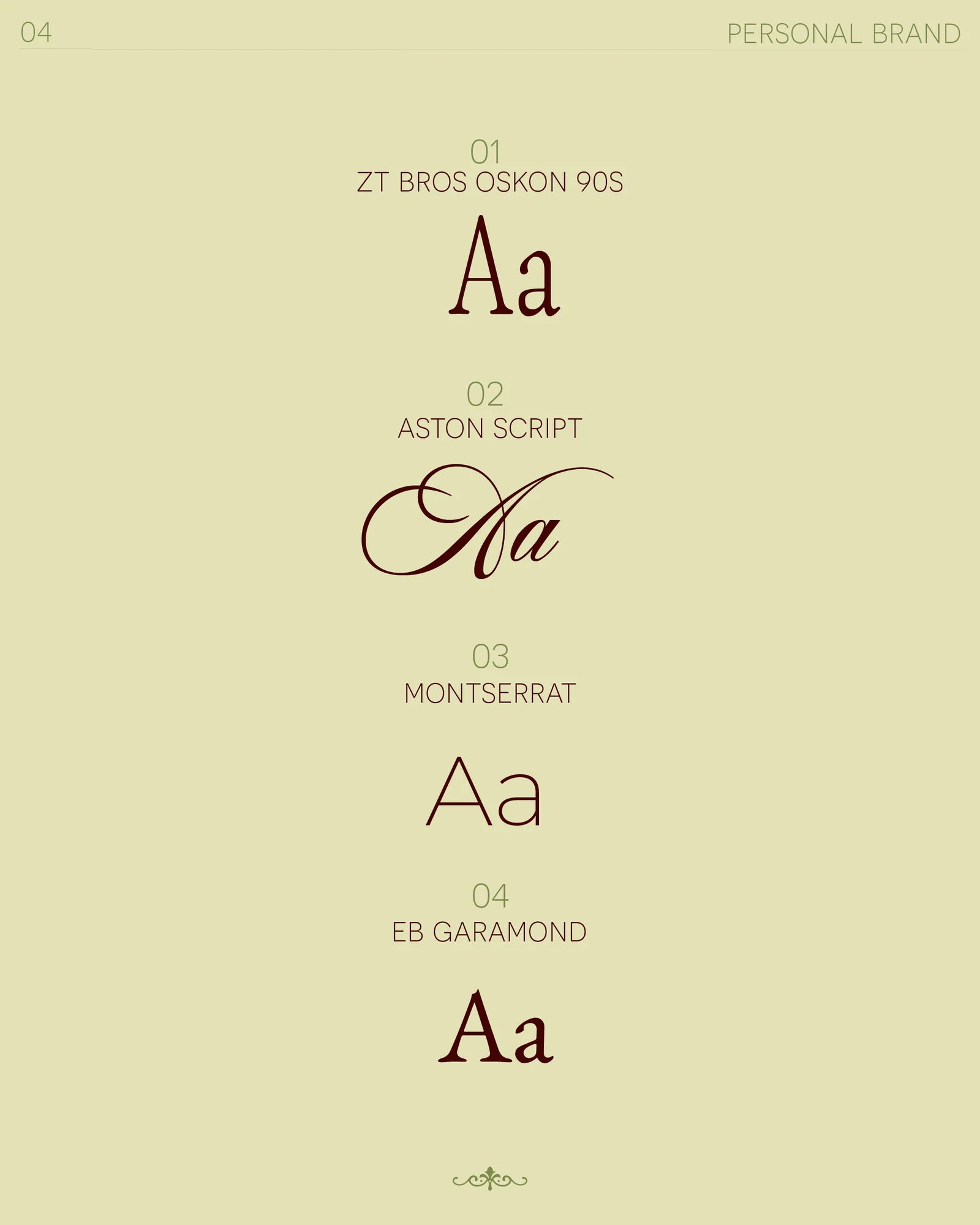
A mix of serif and sans serif to create a clear hierarchy: ZT Bros Oskon for titles, Aston Script for accents, EB Garamond for body text and Montserrat for small details.
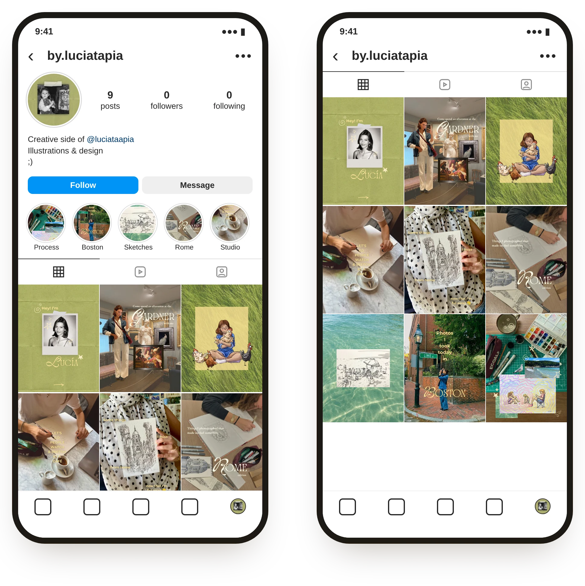
The social media strategy focuses on documenting the creative world behind the brand, and the content is organized around four pillars: process or bts, finished work, inspiration, and everyday life. Together, they create variety while maintaining a cohesive system and more consistent visual identity across the feed.